FontCreator Tutorials
How to Make a Variable Font
written by Erwin Denissen, published June 24, 2021
The concept of variable fonts has been around for decades, but it is only since 2016 that this technology was adopted by the OpenType specification.
A variable font is a single file, containing one or more axes (for example weight or width) which allow you to use a continuous range of style variations by means of interpolation. FontCreator allows you to export a variable font, but it can also be used to export all pre-defined styles (named instances) with a single click, so you can make fonts faster.
This tutorial shows how to create a variable font out of two existing (non-variable) fonts.
We assume you already made a Regular and Bold version of a font family. To get started do open them both in FontCreator.
Weight Axis
Since we combine two fonts with different weight, we need to add a Weight axis.
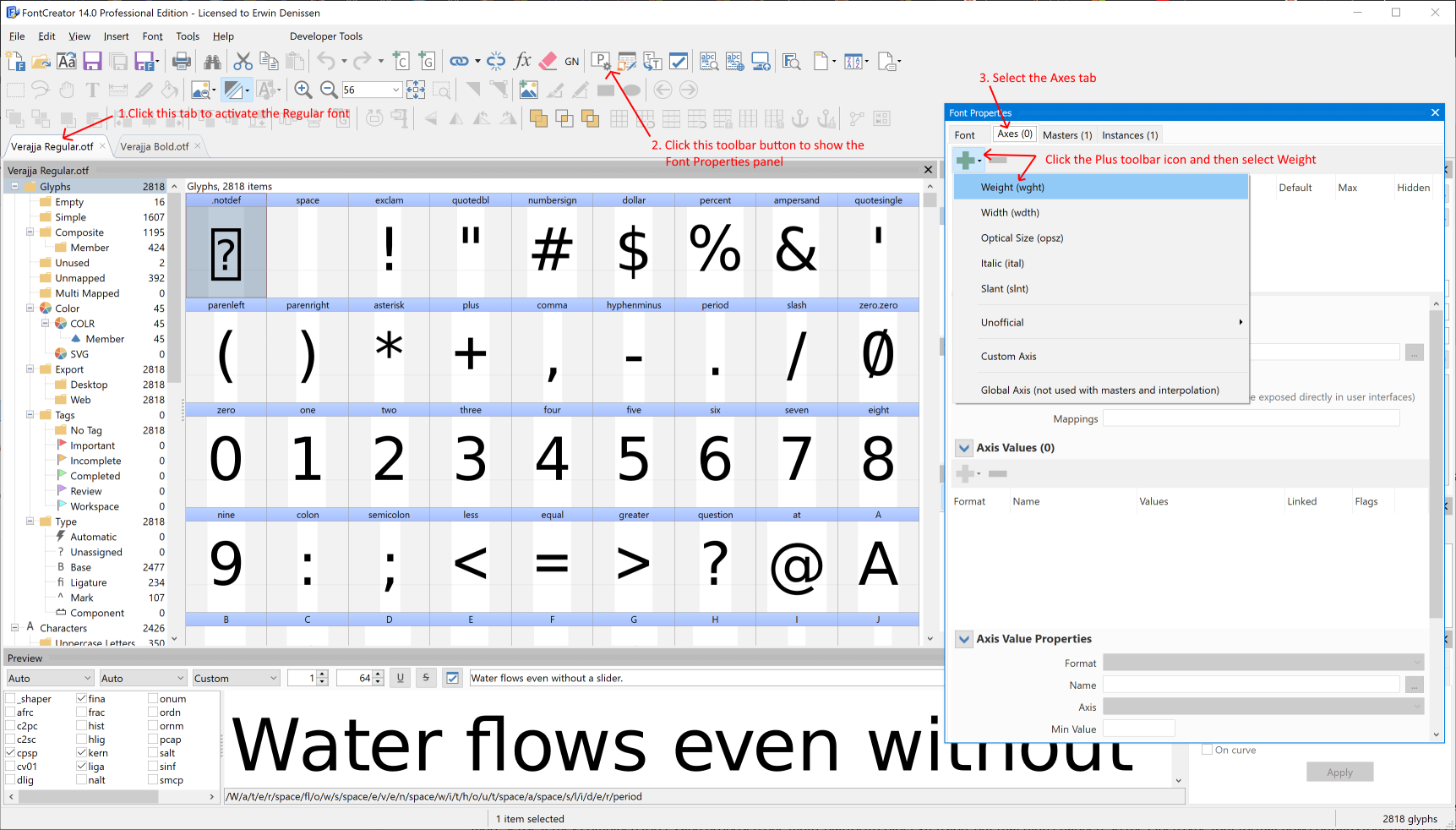
Activate the Regular style (1) and open the Font Properties panel (2).
From there, go to the Axes tab (3) and click the [+] toolbar icon and select Weight (4).

Bold Master
Within the Font Properties panel, select the Masters tab. Click the [+] toolbar icon and choose the Bold font. This will copy all glyph outlines from the Bold font into this one.
Note: At this point you probably notice several glyphs in the Font Overview panel suddenly have a red background header. It indicates these glyphs have compatibility issues and as a result interpolation will fail. We will cover this later in this tutorial.
We need to update the Axis Location for both masters. Select the Regular master and set the location to 400. For the Bold master set it to 700.
At this point we already have a variable font. Well, done!
First Impression
In case you are curious about the results so far, so do we.
To make use of the Weight Axis, we need to get access to the Variations panel. In case it is not visible yet, from the main menu, select View -> Panels, and then make sure Variations is checked. You can also use shortcut Ctrl+F7 to toggle the visibility of this panel.
The Variations panel allows you to preview a location between your masters. Use the Weight slider, and you will see the outlines are automatically interpolated.
There is one more panel we need to use, so let us bring in the Masters and Layers panel. If it is not visible yet, go to the main menu and select View -> Panels -> Masters and Layers. Shortcut Ctrl+F6 also works.
This panel allows you to switch between the available masters. This is important, as the glyph outline layers are always located on a master. Thus, if you want to make adjustments to the Regular glyph outline, select that master.
Test Web Font
So playing with the Weight slider is pretty neat, but does it really work outside FontCreator?
Let's see... From the main menu select Font -> Test Web Font (or press Ctrl+F5). This will export the variable font along with a web page, that is opened in your default web browser.
Compatibility Issues
As we mentioned earlier, interpolation can only work if the outline layers are compatible. So for each glyph, the outline layers must have the same number of contours. They also must be in the same order, and the number of points must also match. For composite glyphs the glyph members must match.
In order to let FontCreator fix basic issues, we select all glyphs within the Font Overview panel, and then click the "Fix" toolbar button at the top of the Masters and Layers panel.
Most likely there are still glyphs with issues. To fix those, we need to manually adjust the glyph outlines. Double-click a glyph to open it in a Glyph panel. The Masters and Layers panel will now show some hints about the kind of compatibility issues.

To further assist in this process, we enable the Show compatibility issues toolbar button, also available on the Masters and Layers panel. This allows us to see what corrections we need to make. In the end all compatibility issues need to be resolved, otherwise your font ends up with glyphs that do not interpolate correctly.
Named Instances
To make the most out of your variable font, it should also contain instances. This way legacy software that lacks support for variation, can still use the named instances.
We go to the Instances tab on the Font Properties panel. Here we update the axis location for the Default instance (400), and we add several more instances with weights 500, 600, and 700. We also provide unique Style Names.
Although not required for the variable font, we also provide correct Weight Class and Width Class values. Those values are important in case we export these instances as non-variable fonts. So we get those almost for free ;-)
Axis Values
There is one more thing we want to cover here. We can provide a name for a specific location on an axis (or even a combination of axes). We simply add axes values that match the axis locations as used in the named instances. So we just add, 400, 500, 600, and 700. We also check property "Elidable axis value name" for the Regular axis value, as that one represents the normal Weight value.